How to Choose the Perfect Color Palette for Your Home
Choosing the perfect color palette for your home is one of the most crucial steps in interior design. Colors have the power to influence emotions, enhance visual appeal, and create a sense of harmony in your living space. A well-chosen palette can make rooms feel larger, cozier, or more vibrant, depending on your goals. In this guide, we’ll explore practical tips and expert suggestions to help you select the ideal colors for every room.
🎨 Why is Choosing the Right Color Palette Important?
Colors are more than just decorative elements—they define the mood and personality of your home. A thoughtful combination of hues can create balance, complement architectural features, and reflect your personal style. Poor color selection, on the other hand, can make even well-designed interiors look dull or chaotic.
Factors to Consider Before Selecting Colors
- Natural Light: Rooms with ample sunlight can handle darker shades, while dim spaces benefit from lighter tones to enhance brightness.
- Room Size: Light, cool colors make small rooms feel larger, whereas warm, deep tones create intimacy in spacious areas.
- Existing Furniture: Coordinate your wall colors with existing furniture, flooring, and decor for a cohesive look.
- Mood & Functionality: Bedrooms should feel calm, kitchens energetic, and living rooms welcoming. Choose colors accordingly.
Popular Color Schemes for Homes 🏡
1. Monochromatic Scheme
This scheme uses different shades of the same color for a sleek, minimalist look. For example, pairing light gray walls with charcoal furniture creates a modern, unified aesthetic.
2. Analogous Scheme
Colors that sit next to each other on the color wheel, such as blue and green or orange and yellow, offer a harmonious and natural feel, perfect for living rooms and bedrooms.
3. Complementary Scheme 🌈
This bold combination uses colors opposite each other on the color wheel, like blue and orange or purple and yellow. It’s ideal for creating high contrast and visual interest in modern interiors.
Room-Wise Color Suggestions
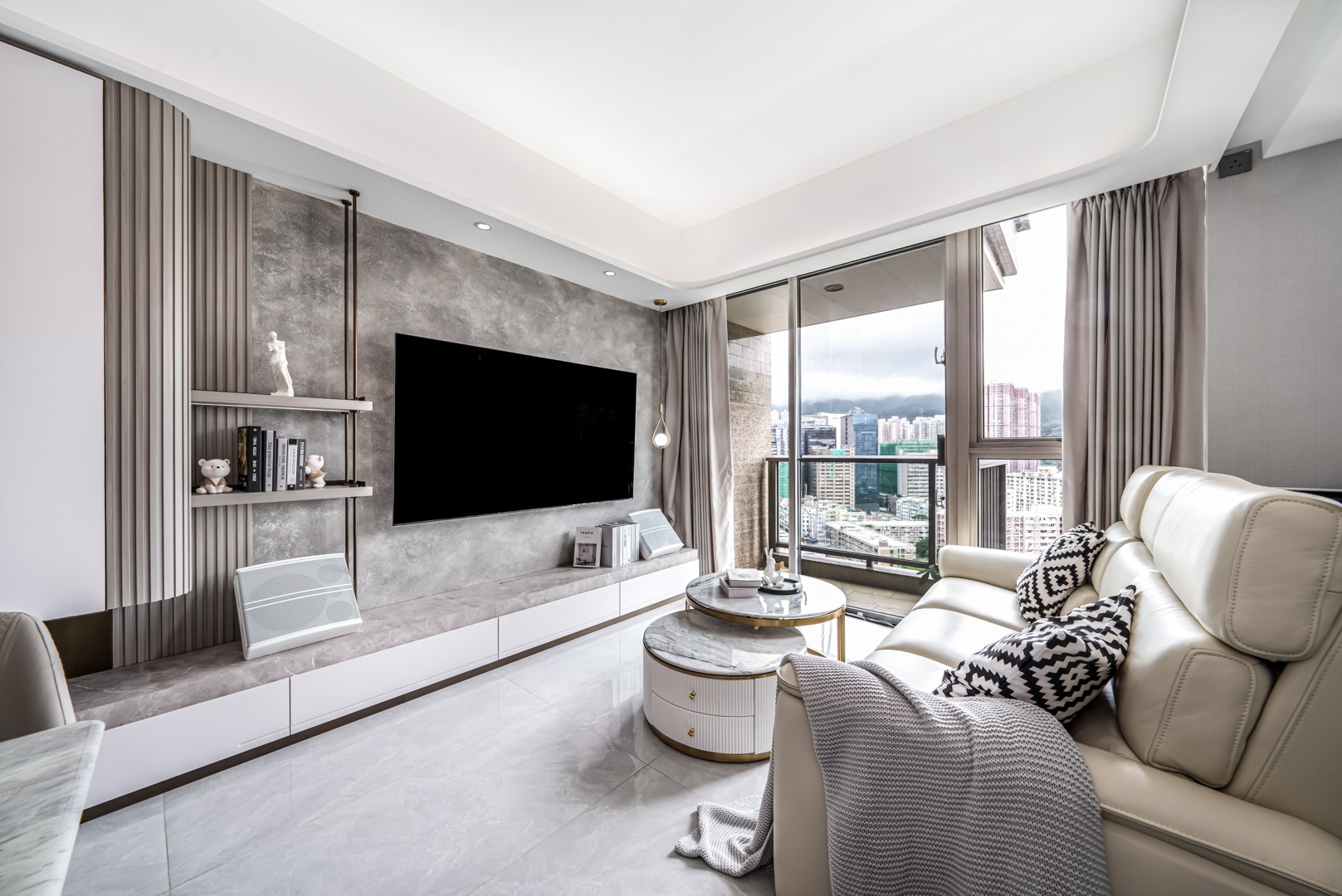
- Living Room: Neutral shades like beige, ivory, or soft gray paired with vibrant accents create an inviting space for socializing.
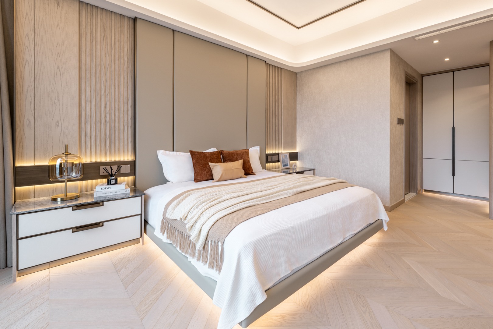
- Bedroom: Soft pastels, blues, and muted greens promote relaxation and restful sleep.
- Kitchen: Warm hues like yellow and light orange stimulate appetite and bring warmth to the heart of the home.
- Bathroom: Whites, light blues, and seafoam greens evoke cleanliness and freshness.
Trendy Color Choices for 2025 ✨
This year, earthy tones like terracotta, muted greens, and soft browns are trending for their calming effect. These hues bring nature indoors, offering a soothing environment in modern homes.
Tips for a Perfect Color Combination
- Use the 60-30-10 rule: 60% dominant color, 30% secondary shade, and 10% accent.
- Always test paint samples on walls before finalizing to see how they look under different lighting conditions.
- Balance bold hues with neutral tones to avoid overwhelming the space.
- Incorporate textures and patterns in cushions, rugs, and curtains for depth and dimension.
✨ Conclusion:
Choosing the perfect color palette for your home is about blending aesthetics with functionality. By considering lighting, room size, and personal style, you can create a cohesive and visually pleasing environment that enhances comfort and reflects your personality. Experiment thoughtfully and let your home tell your story through colors.